
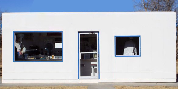
 Valentine with detailing removed. Original photo by Michael Engle
It’s remarkable how Valentine was able to have such a wide range of products, with designs spanning decades, all based on what was essentially the same central unit, a more or less featureless, flat roofed white rectangular box. In architecture school, we had a running joke about “applied style”- how some architects just throw materials and detailing onto a form to which those things have no relation. In Montana, the classic example is the mega mansion log cabin. It’s not a lodge, it’s a generic form that “style” has been applied to. In the MT case a log veneer and corrugated metal, but elsewhere, it could just as easily sprout Mediterranean columns and tile work or shake shingles.
The term “dumb box” gets thrown around referring to rectangular skyscrapers or is derogatorily applied to buildings without merit. In this case, I use it as praise. The core of a Valentine Diner is a blank canvas, a module in the most basic sense. While east coast diners kept the basic long low proportions almost from their inception, their forms changed dramatically over the years, from barrel roofs to monitor roofs to stainless parapets and mansards. A monitor roof O’Mahony and a barrel roof O’Mahony, for example, required very different constructions.
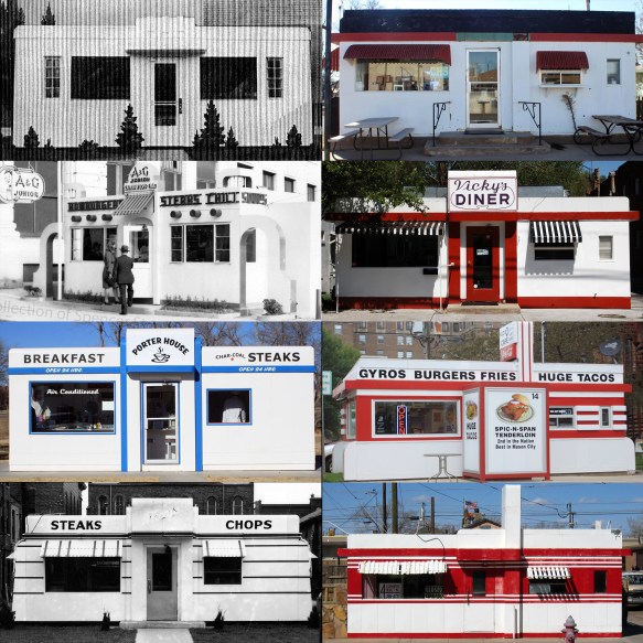
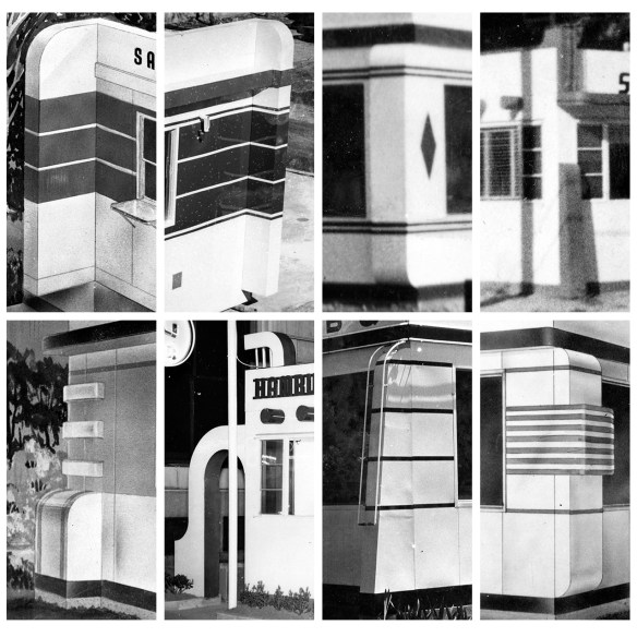
Let’s take a look at the A&G Junior in New Orleans. The overall impression of the building is a moderne take on stucco Spanish Revival architecture, with arched openings and exposed round timbers. It is, of course, metal rather than stucco and wood, with industrial windows and neon, expressing its own identity and function rather than giving in to complete stylism. Look a little closer and you’ll see all those details which give it that spanish revival look are bolted on, stand alone details added to the same central box. Leave that box alone, remove those details and add a tower- instant White Tower. Add a tiered pylon around the door and angled panels where the arches are, you get Neill’s Drive Inn or Foxy’s. Swap those angled panels for shorter straight versions (but notice, they’re the same depth) and you get the Master. Change the parapet a bit, and only bolt on the back panels and you get the Navajo. The striped paint jobs so many of these came with start to define a sense of architectural rhythm. On diners that have been repainted (Winslow , Hershey, Auburn) you’ll notice how much has been lost. The canted sign and larger windows of Cindy’s give it a space age look, but the interior, construction and overall base unit are more or less unchanged since the Hayes built diners of the 1930s.
This also brings up the question of who designed these diners. The promo materials say, “design by Gilbert”, but I believe it’s more likely there was no single person named Gilbert, that this was a reference to Gilbert St. and a way to keep credit for the design in-house and anonymous while still having that “hand of the designer” to put on the drawings. Richard Ten Eyck has been credited with Valentine Diner design. He was attending school for industrial design in 1938-1939, after the Ablah in the layout above (which has the proportions, pylon and basic design that was used by Valentine through the 1940s and 1950s) was designed. But although the bones were in place in the 1930s, the detailing and signage are so much of what make these places unique. Arthur Valentine was credited on the patents which were granted for various designs, but as the owner of the company, that’s not surprising at all, and doesn’t necessarily indicate that he personally designed any of it. The little I can find about Ten Eyck’s involvement that isn’t blogs overstating quotes on other sources says he was only involved in 1948 on the Master model. Other sources say the Aristocrat. If you look at the master model, it’s only the most minor tweak from earlier designs, one stool larger, with the sign turned 90 degrees.
